
When it comes to sports apparel, baseball is in a league of its own. While the stylish jerseys can make for nice casual wear,
it’s the caps that have truly taken on a life of their own. They’ve become representative of more than just a person’s allegiance to their favorite team, stretching out into social movements and pop culture expression. Major League Baseball has seen many
hats come and go, and everyone has their favorites. Here is a modest list of the 10 best baseball caps of all time.
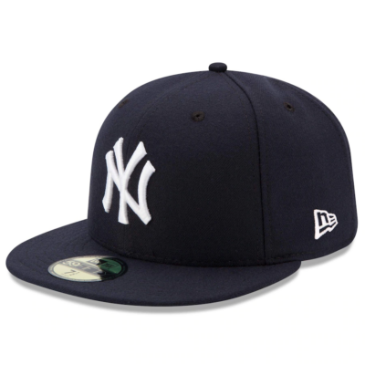
New York Yankees (1915-Present)
Simple, yet enduring. The New York Yankees have sported this look for over a century, and it’s easy to see why. Not only is it the logo of the most accomplished sports franchise in history, but it’s become synonymous with hip-hop and urban culture as a whole. From Times Square to the Great Wall of China, you’ll find someone wearing this hat even if they aren’t a Yankees fan.
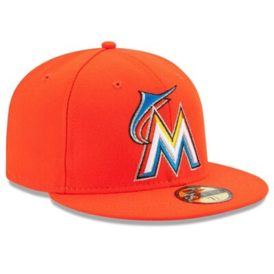 Miami Marlins (2012)
Only worn for two games in their inaugural season under their new “Miami Marlins” branding, this citrus-colored hat was the perfect embodiment of the all-sizzle, no-pop team of that season. The bright color scheme was a bold yet perfect representation of the city of Miami, which makes it all the more painful we only got to see them worn in-game twice.
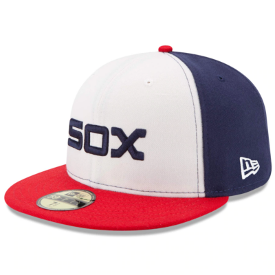 Chicago White Sox (1982-1986; 2013-Present)
Back in the ’80s, the White Sox abandoned their monochromatic color scheme. This resulted in a simple, yet sleek design that gave the South Siders a distinct look and feel all their own. While short lived, back in 2013 the team brought the look back as an alternate uniform and gave a whole new generation of fans a chance to see their best look.
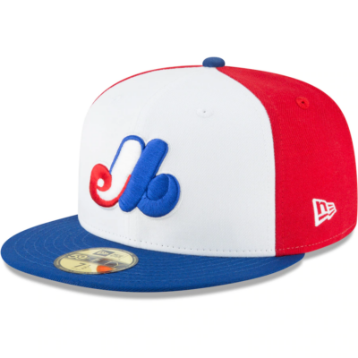 Montreal Expos (1969-2004)
Losing Montreal’s baseball team was a tragedy for baseball. Even worse was losing these incredible caps. The bright red, white and blue pops with color and immediately attracts the eye and is a stylish look with just about any outfit. The logo also holds complexity too, as the colors inside the giant M spell out the initials “E” and “B”, a subtle way of having the cap say “Montreal Expos Baseball” without drawing too much attention away from the M itself.
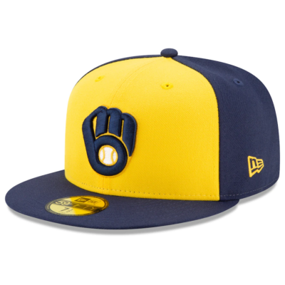 Milwaukee Brewers (1978-1993; 2020-Present)
Back when the Brewers were an American League team and banging on the walls of every stadium on their way to the 1982 American League pennant, Milwaukee was rocking an iconic look that defined the greatest era of their franchise’s history. The baseball glove logo created with the “M” and “B” is one of the most creative design choices in the sport. It was brought back permanently only a couple of years ago and baseball has been better for it since.
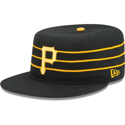
Pittsburgh Pirates (1976-1987)
The unique box shape. The piping. Stargell’s Star’s decorating the sides and brims. The look of one of the most iconic teams in baseball history. There was nothing like it before and there was nothing like it since. What more could you ask?
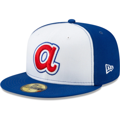 Atlanta Braves (1972-1980)
The unique “softball uniforms” the Atlanta Braves rocked in the ’70s gave way to their most colorful look in franchise history. This was the logo and cap Hank Aaron wore when he passed Babe Ruth, that lowercase “A” being the lasting image of one of baseball’s most historic moments. It’s a funky, stylish reminder of a decade built on individuality and pop.
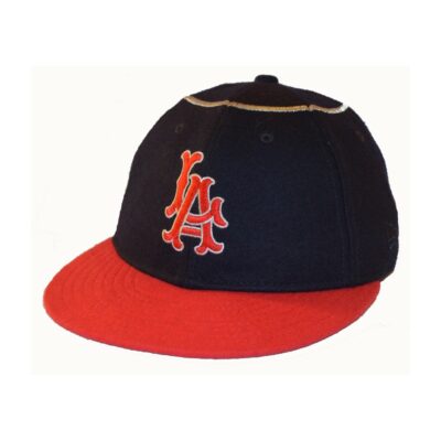 Los Angeles Angels (1961-1964)
It’s rare that the original model is the best, but these old-school Angels caps felt as if they were blessed by heaven itself. While the logo might be reminiscent of their crosstown rivals, the real standout is the gold piping on the top of the hat that is supposed to be the halo to their angelic attire. It’s a unique classic that should have been around much longer than only their first three years of existence.
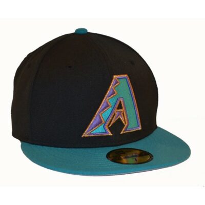 Arizona Diamondbacks (1995-2007)
Nowadays, the Diamondbacks are known for their deep crimson color pallet. But before that change in the mid-2000s. their uniforms sported teal, gold and purple. It was a unique set that to this day has yet to be matched and it showed in their caps. A variation of this look was what the team wore when they won their only World Series in 2001, but this colorful cap was certainly the basis for what came next.
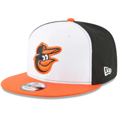 Baltimore Orioles (1975-1989; 2012-Present)
The charm of their logo does a great job of masking the poor play on the field. The bright orange and white contrasts perfectly with the harsh black within and was the look and feel of some of this franchise’s bests moments. After a brief stint with a realistic oriole logo in the ’90s and aughts, the O’s brought back this iconic look a decade ago and it has endured since.
Carter Gil de Rubio is an Anton Media Group contributor.
Be the first to comment